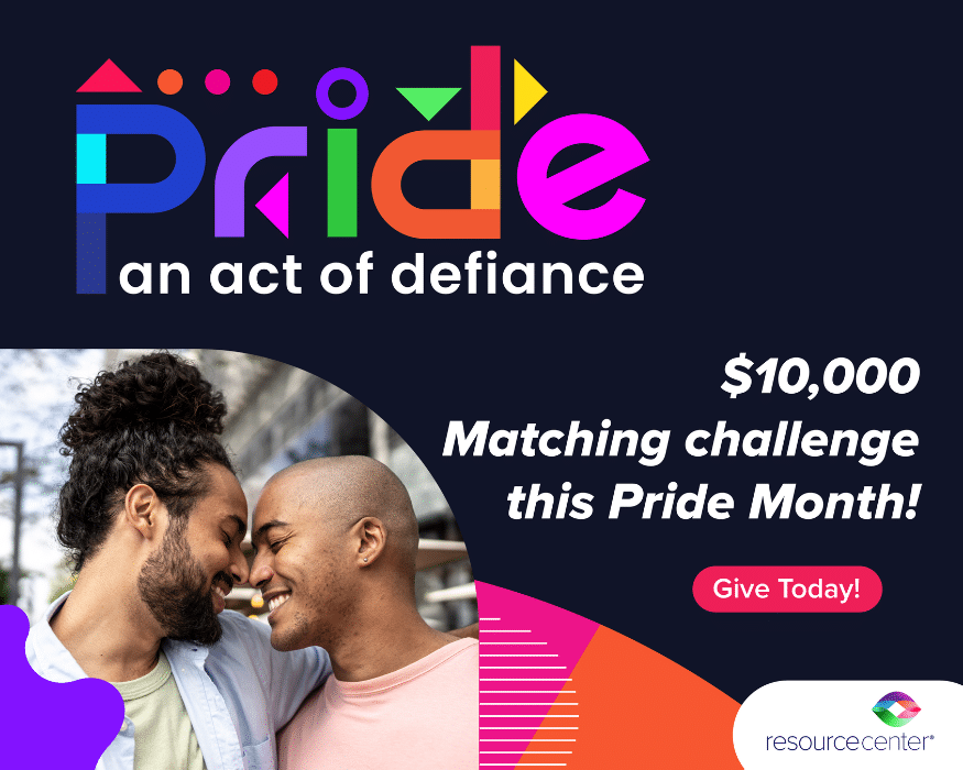
June 2021
An organization’s logo and branding is central to it’s identity. This week, we’re giving you the story and process behind our current logo as told by Resource Center Board President Emeritus, Deborah McMurray.
Video Transcription
“Happy pride month, 2021! My name is Deborah McMurray and I am currently serving as President Emeritus of Resource Center’s Board of Directors. I hope you love Resource Center as much as I do, but in the event that you don’t know everything about it, I want to take this Pride month and tell you a little bit about the origin of the Resource Center logo
I started on my board service at Resource Center in October, 2011. Every three years or so, Resource Center engages in a strategic planning process. And the research part of the 2012 plan was very comprehensive. At the same time, Resource Center had a marketing committee that I chaired. And as it related to the brand, it was clear, we wanted to develop a new brand. It was the de facto chairs of the brand committee Brett Gray, who I know many of, you know, and me leading the charge. In the context of the strategic plan, Resource Center, did a lot of research of its various and numerous constituents.
The research results were loud and clear; it was time for Resource Center to create and launch a new brand. So building on that, we created a brand committee, which we called the creative brain trust. We conducted several focus groups,14 individual stakeholder interviews, and we studied 700 responses to the online needs assessment survey that was done as part of the strategic plan. We also queried eight design agencies for their impressions of the messaging, the brand, and the name. In our focus groups and brainstorming sessions, these are the words that rose to the top.
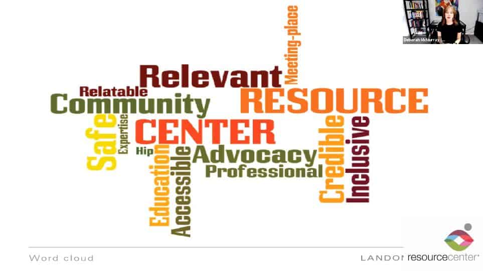
These were the most important attributes. The new logo had to marry and reflect these attributes. This was the logo at that time. And these were the challenges and the findings identified in the strategic planning survey:
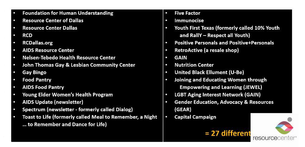
The name was generic. There were too many, many names under the Resource Center umbrella. There were a total of 27. There was also a lack of consistency of use of all the properties and communication and pieces within Resource Center. All had different brands. The word Dallas didn’t any longer reflect the full reach of the organization, which was at least, broadly throughout the DFW area. The brand didn’t reflect Resource Center’s, growth, sophistication, or influence. And the design agency, people said that the logo had visual imbalance and low impact. These were all of the Resource Center names in 2012, that the agency was managing:
It’s a lot to keep track of. The rebranding process was very diligent and very classic. We prepared an RFP for a logo and identity creation. We established a budget and I might add that we came in at the $5,000 level, as opposed to having to go up to the $10,000 level. We identified and invited eight well-regarded design and branding agencies to respond. The “creative brain trust” reviewed the proposals interviewed six firms, recommended three of those firms to Resource Center’s marketing committee, and the winning firm was Michael Landon design. So we presented five designs to the Board who then unanimously chose a winning design.
But wait, what about the name? There was a lot of consideration given to the name. The feelings of the focus groups were divided into two distinct camps: legacy supporters who had a long history with Resource Center and newer supporters. There were a few names that were considered, and these were the names that rose to the top of those that were considered:
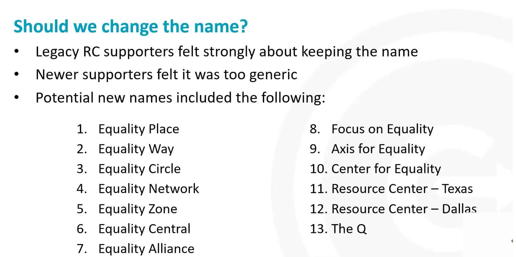
But we changed the name to Resource Center, which meant we kept the high brand equity name of Resource Center, but we got rid of the word “Dallas.”
Here’s our beautiful logo. This was the unanimous logo choice. The color choices are a modern rainbow, not the typical primary colors that you often see in the rainbow flag. We didn’t want anything about this logo to become genericized and because the rainbow colors and the rainbow flag is so popular and really has become a generic representation of the community. We wanted to make sure that Resource Center’s, logo represented it and elevated it. These modern rainbow colors are the perfect complement to the black and gray of the name Resource Center. The gray circle balances, the word “Center”, which of course is also in the same gray. The color palette signals that this is an organization designed for the future. We kept the lowercase letters from the prior logo because it shows accessibility, friendliness, and familiarity with the icon above it, the rainbow, and the circle. The icon is both elevating, literally as it hovers above the word center and inclusive, the overlapping colors in the waves, expand the color palette and show depth and dimension, which is a nod to our 36 year history and the three main pillars of service that we provide: improving health and wellness, strengthening families and communities and providing transformative education and efficacy. And the icon itself is both a highly stylized person moving ahead, moving forward. And it is a pair of hands coupled to show that what’s inside is safe. The circle is a universal system or symbol rather with extensive meaning it represents: the notions of totality, wholeness, original perfection. The self, the infinite eternity, timelessness, all cyclical movement. It also represents constancy in life on a continuum and the waves that you see in many, many of our materials, most of our material, online and offline.
I hope this little snapshot of what Resource Center’s logo means and helps you appreciate it a little bit more.”